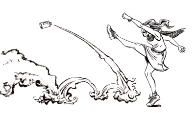
I just finished what I consider to be a particularly good page of Savage Nobles in the Land of Enchantment, maybe one of the best. Not counting thumbnails, I did the entire page from start to finish in one day – actually just about 7-8 hours if you subtract all the time I spent singing in choir, hackey-sacking in the park, applying online for unemployment compensation, and queuing at the Department of Health and Human Services.
(please click the image to see the full-sized version!)
Though I am pleased with almost every aspect of this page (the page layout; the blocking of the figures; the human anatomy, gesture, and costume; the sweet but not saccharine tone, lightened by a little humor; the foreshadowing of Manaka’s concerned glance) there are, as always, things I wish I could do better. Pro-inker Gary Martin, who graciously carved me a brand new anus while reviewing my portfolio at this year’s Stumptown Comics Fest, wants me to focus on my line weight. So although I was already trying to use heavier lines opposite my light source, I’m trying even harder now – it worked pretty well on Theo’s face in panel 4. I don’t necessarily want the uber-slick look of some of Gary’s (admittedly amazing) inking for my own comics, but even if I ultimately opt for a smudgier/sloppier treatment, it’s still a skill I should have under my belt. Some of my lines, I think, are still way too thin, and I am still struggling with ways to create grays – my crosshatching is hopelessly haphazard and 165 pages later I am still smearing my drybrush all over the place inadvisedly.


