

SNitLoE was always meant for print, even before I started posting it online, and now that I’m done drawing the story I’m wasting no time turning this ungainly webcomic into a beautiful paperback book. One important part of this will be designing the cover. I’ve always imagined a cover similar to the image currently on the facebook page, which I also use on promotional cards. It’s the band standing in the desert with their instruments, Tonya’s fist in the air. I drew that picture almost a year ago, so obviously I’d redraw it nicely for the book cover.
This afternoon I messed around with a couple other designs. Please vote! Bare in mind that these are very loose sketches – the exact layout and colors will probably be different, so just vote based on the general idea of the cover.


1.) Original 2.) Blue New Mexico


3.) Abbey Road 4.) Face Window


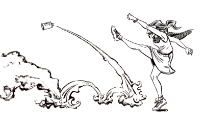
5.) Thirsty and Miserable 6.) Upturned Van
[poll id=”2″]
There is something about designing covers that draws artists towards symmetry. Do a Google Image Search for the phrase “graphic novel cover” and see how many of them display strong bilateral symmetry. While the interior of a comic may be full of dramatic dynamism and daring diagonals, covers are often comparitavly static images. I think this is because, while comics are supposed to convey the passage of time, covers often show a frozen moment, or a representation of a state of being rather than a narrative event. Look at the amazing similarity between these covers by two of my favorite young comics artists in Portland, Sarah Oleksyk and Dylan Meconis. It’s pretty remarkable.


Remarkable!