Begin Operation Hot Zone Kill!
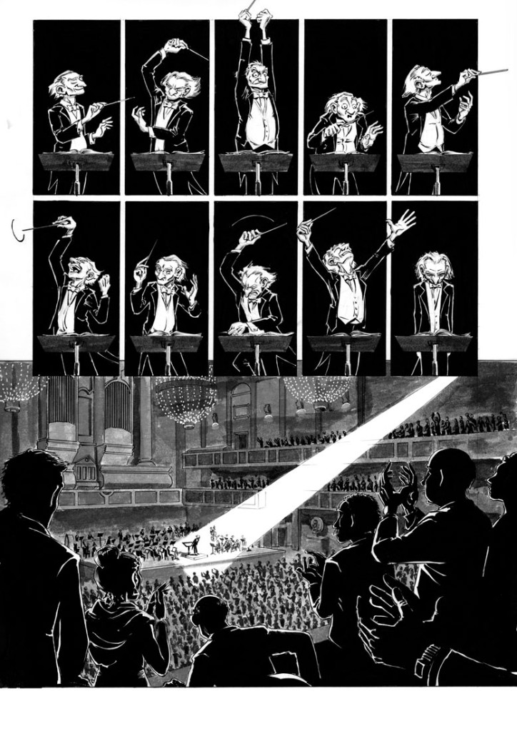
Here’s a panel from page 16 of Symphony Number Six. I’m extremely pleased with how the page turned out, and I debated posting the entire thing here – but I think it would give away too much about the story, and I want you all to be surprised.
My friend Paul Guinan recently suggested something interesting to me: while 90s darling Rob Liefeld is now roundly mocked by basically everybody for his totally bogus drawings, Frank Miller, perhaps guilty of much of the same erroneous anatomical construction, is still praised sycophantically. (I would agree with Paul’s assessment of Miller’s draftsmanship – it’s particularly noticeable on his women characters). The difference, according to Paul, is that Liefeld made his own errors more visible by filling them up with flashy crosshatching, while Miller covers his up with atmospheric pools of black. “But one thing Miller has going for him,” Paul conceded, “is a great sense of design.”
And this sense of design, I’m learning, covers a multitude of sins. My rendering on these last few pages of SN6 is as loose as it’s been since I first started cartooning again about four years ago. But as long as I’m confident that I’ve:
- Laid out the panels, and the elements within each panel, in a narratively sound way that conveys the action of the story and the mental or emotional states of the characters, and is also attractive.
- Penciled the elements in the panel with some solidity and structural accuracy, and gotten the facial expressions right.
… then it really doesn’t matter how tightly I hold my brush! (One of the people I’ve kinda picked this up from is Fabio Moon.)
Read MoreFireside Conference
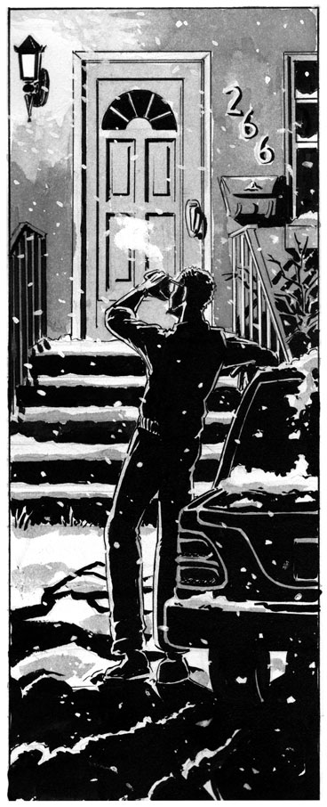
Here’s a recently finished, moody panel from my upcoming comic “Symphony Number Six”:
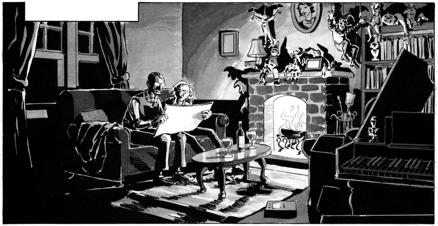
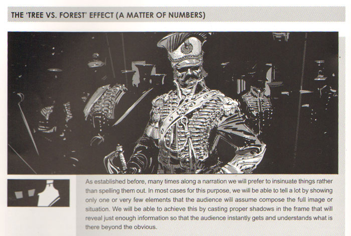
Boy, did that take a long time. Even though I saved myself some work by plunging parts of the image into blackness, I could always have gone further. I need to take a lesson from Marcos Mateu-Mestre, author of the excellent Framed Ink: Drawing and Composition for Visual Storytellers, which I have managed to read three times without learning its lessons.
Read More
Rainy Sn6 Panel
I seriously picked the best month in Oregon to ink this comic.
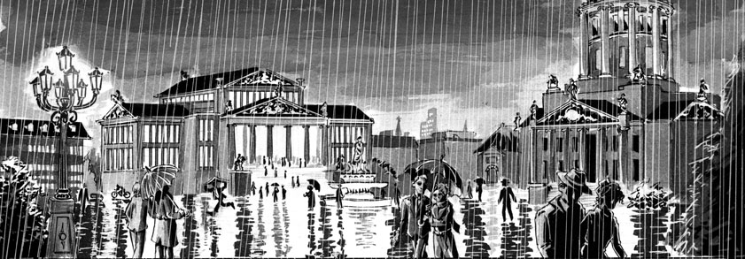
The streaks of rain were added digitally in post-production. I almost added them directly to the page with white gel-pen, but I didn’t. I’m glad, because this looks much better.
Read MoreConcert Hall
Here’s my most recently completed page of “Symphony Number Six.” Took longer than I would have liked, but boy was it worth it. One of the pages I’m most proud of:
Ever since meeting the artists of Periscope Studio, I’ve been very mindful of “shortcuts” by which a large crowd can be depicted without actually having to draw a large crowd. Some of these are very evocative, and they certainly save time. Nevertheless, sometimes I think the effect of seeing a giant mass of people painstakingly drawn is worth it.
The conducting postures are inspired by Hans Schliessmann’s live sketches of Gustav Mahler. The theater is the Berlin Konzerthaus, the lavish exterior of which will be featured in the first panel of the next page.
Read MoreHappy Couple
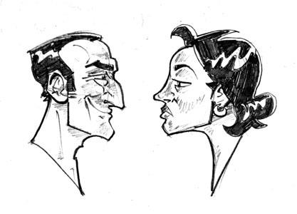
Drawn during a boring meeting. I’ve been thinking about J.C. Leyendecker a lot lately.


