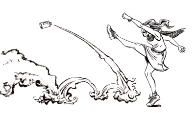


Art for my own Release Party Flier.
Hey Apostrophobiphiles! If you read this blog then you’ve probably heard all about my graphic novel Savage Nobles in the Land of Enchantment, which is now available in print. I’m having a release party on Saturday, October 1st from 4-6pm at Cosmic Monkey Comics in NE Portland, OR. Below is the flyer for that event:

I am sort of please with the artwork for this flyer and sort of not. I think I am getting a better and better “knack” for composition. A big help was reading Framed Ink: Drawing and Composition for Visual Storytellers by Marcos Mateu-Mestre. He has truly amazing skills at designing compositions that are clear, pleasing, and intuitively comprehensible, even when depicting complicated action. He also has a somewhat sketchy, digital graywash style that looks so effortless it must be affected. Since “Framed Ink” is mostly geared towards storyboarding, I found myself wanting to design a SNitLoE scene with a short, wide frame like a movie screen.
(click for larger version)
So while I think the composition is basically sound, I have a lot of qualms about the artwork itself. While I’m glad I rendered the desert mountain beyond a simple sandy mass, I think I might have gone too far the other way – the characters, especially Theo, get lost among the jumble of lines in the rocks. Somehow I am not differentiating enough with my inking between “flesh,” “cloth” and “rocks.” The blacks are not well placed. There’s something wrong with pretty much every single hand in the picture, and some of the proportions are way off. Oh well, it’s just for a flyer that’ll probably get torn down anyway!
Two things to note: Yes, “algebraic” is misspelled – I corrected it on the finished flyer. And no, a scene like this never occurs in the actual story – but neither does the scene I drew for the cover of the book. Only Tonya and Greg discover Utopiopolis, and they are not dressed that way when they do.
Read MoreSNitLoE Pre-Orders.
You can now pre-order the print version of SNitLoE from my online store!

I will mail your copy (or copies) as soon as the books arrive, probably on or around the weekend of September 24th. Books cost $15 each, plus a one-time shipping charge of $5. If you like, I will sign your book and draw a little doodle of one of the characters on the title page.
The store page also has a free download of the entire comic as a .cbz file. If you have friends who enjoy the soulless experience of reading immaterial comics by the cold blue glow of an iPad or laptop, please tell them about this download!
The store also has buttons! But these are not really worth buying unless you are also buying a book!
Lastly, if you live in PORTLAND FREAKIN’ OREGON, you should definitely save yourself $5 in shipping by purchasing a book from me directly. A good place to do that might be my release party on October 1st at Cosmic Monkey Comics. But you can just as easily accost me in the park, at the Max station, in my own bed while I’m sleeping, etc. and I will gladly sell you a book on the spot.

Benjamin Franklinstein!
Today is Independoween, the holiday that is calendrically equidistant from Halloween and the 4th of July. The holiday was the brainchild of my friend Xavier Lyles, who envisions Independoween celebrations as containing the best of these two holidays: fireworks AND costumes; backyard barbecues AND candy; jingoistic patriotism AND a spooky sense of the macabre. You could carve an American flag into a pumpkin. Or you could dress up like Independoween’s unofficial mascot, Benjamin Franklinstein:

It would have been really cool if Xavier and I were the originators of Ben Franklinstein, but unfortunately that isn’t true. I discovered that people have been mashing these two together for quite some time. There’s even a YA book about the character. Alas, there is nothing new under the sun. It is with great sadness that I’ve decided not to suggest this idea to Dylan Meconis as a potential follow-up to her werewolf/Enlightenment and vampire/French Revolution franchise.
However, my unoriginality is not simply a coincidence. A quote from Frankensteinia, an all-Frankenstein-all-the-time blog:
The connection between the Franklin and Frankenstein has been explored extensively. The real-life Franklin and the fictional Victor Frankenstein were contemporaries, and both were electrical experimenters. Frankenstein observed a tree shattered by lightning, and Franklin apocryphally flew a kite and a key in a thunderstorm, inspiring movie Frankensteins to release kites, capture lightning and zap monsters to life.
Mary Shelley was familiar with Franklin and his experiments. Her mother, Mary Wollstonecraft, was tutored in politics by Dr. Richard Price who supported the American Revolution and corresponded with Franklin. One of her publishers, Joseph Johnson, had released Franklin’s works in London, and her lover, Gilbert Imlay, was American and a Revolutionary fighter. Mary Wollstonecraft’s husband, William Godwin, was influenced by Franklin’s politics and he was a member, as was Franklin, of the scientific Royal Society of London. Mary Shelley’s companion, Percy Bysshe Shelley, studied Franklin and was conversant with electrical experimentation.
There is frequently quoted speculation that Mary’s choice of name for her scientist was inspired by, and perhaps even an homage to Franklin, though “Frankenstein” was not a rare name and Mary had almost certainly encountered it in 1814 during her trip down the Rhine and a stopover in the vicinity of Burg Frankenstein. Nevertheless, it is said that Franklin’s electrical experiments were so widely known and notorious that the novel’s original readers, back in 1818, would have easily made the Franklin/Frankenstein connection. Many scholars have since explored the influence of Benjamin Franklin on Mary Wollstonecraft, William Godwin, Percy and Mary Shelley, and its reflection in Mary famous novel, making Founding Father Benjamin Franklin one of numerous men of science of the era who are thought of as the “real” Frankenstein.
Ain’t that fascinatin’? Happy Independoween, everybody!

Disney Princess Color Analysis
You know how sometimes you have an idea as soon as you wake up? This morning, this was mine:

It’s a combination of Scott McCloud’s approach to analyzing Golden Age superhero costumes, and Dustin Weaver‘s recent observation that, with her bold, primary colors and jet black hair, Snow White is basically Superman.

Just as we involuntarily, subconsciously know that purple + green= Hulk, red + gold = Iron Man and gray + bluish black + a tiny bit of yellow = Batman, we can’t see that unique combination of blue-green, red, flesh and lavender without immediately thinking (in a Jamaican accent) “Ariel!” We can instantly recognizable all the Disney heroines from their color schemes alone. I haven’t tried it with any other characters, but you can easily imagine similar color swatches for villains (Ursula, Gaston, Jafar, Scar, and Radcliffe all have wonderful and very distinct color schemes), heroes (think of Beast, Aladdin, John Smith, or especially Quasimodo), or even supporting characters (though characters like Flounder, Genie, Phoebus, or Mushu tend to be colored from much simpler palettes.) In every case, the colors are as unique as the character designs themselves.
(Notice that with the exception of Snow White these are all characters from the post-1989 Disney Renaissance. Disney had some terrific character designs in the 30’s, 50’s and 60’s, but the color element doesn’t particularly stand out for me. Quick! What color was Aurora’s dress in Sleeping Beauty? …See? Even if you know, you had to think about it.)
I don’t understand color. I barely understand how it works in real life, and I’m certainly not to the point of being able design with color in an appealing way. What Disney does (or did?) is simply amazing to me. They can paint with all the colors of the wind!
(By the way, here’s a link to a cool artist who drew many of the Disney princesses as superheros.)
Cartoon for Ali Farzat
Ali Farzat is a great Syrian political cartoonist. Recently he was kidnapped by paramilitary thugs (believed to be working for Pres. Bashar Assad) and brutally beaten. They deliberately broke both of his hands.

(click for larger version)
I was going to write a long tract about the metaphorical dimension of this horrible attack, but it’s all pretty obvious, really. Farzat spoke Truth to Power and met a fate similar to so many who do. I’ll just add that Farzat’s cartoons are awesome, and he’s obviously a man after my own heart, my very favorite type of political cartoonist. Google him some time. It’s purely visual storytelling – no patronizing labels or captions, none of the gags based solely on dialogue or wordplay which have made our own editorial pages so trite and boring. What’s even better, Farzat seldom caricatures specific individuals. He rarely, for instance, draws the tyrant Assad. Rather, he seems to draw “types,” the archetypal plutocrat, politician, pauper, or proletarian. This is such a great way to de-emphasize transitory “personality politics” and keep the focus where it should be, on the long-term conflict of classes.

By the way, on the off-chance that somebody wants to read my cartoon right-to-left, here’s the Arabic version:

Get well soon, Ali. Get well soon, Syria. Ash-sha`b yurid isqat an-nizam!